From Hamburgers to Kebabs
Like with any industry, the world for web design and build has its own array of buzzwords and terms. Some of these terms escape and make it into the common parlance, where are others remain only known to inner circle of geeks.
Menus within website have been vital since the start of the internet, they serve to separate out different sections of a website, with clear and obvious section names. Similar to menus you might be in a restaurant; they break up information, like a classification, only with a food menu it might break up starters, mains, deserts, and drinks.
For any years this worked fine, with the only real variation in menus being if it should be presented across the top, or down the site of a website; and they came the mobile web.
Both of these well-established menu methods didn’t work on a mobile device, across the top didn’t fit and the down the site option took up far too much of the screen, changes were required; the menu needed to be packed away.
Pretty early on through the process of designing for mobile, it was realised that the menu isn’t part of the content, however it’s something that a user needs to be able to access to move and navigate around the site. Therefore, it needed to be available, but only when required.
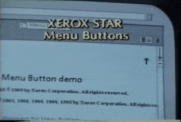
As designers looked for a suitable solution, people stumped across a solution produced many years ago by a designer called Norm Cox. In 1981 he was working on the design for the world’s first graphical user interface on a computer called the Xerox Star. Within this desktop interface, computers were still mainly command line based at this time, he needed to come up with an icon to represent the menu list for the word processing tool. His thinking was to create a small icon that looked like a restaurant menu from far away, where you could only see the section titles; this resulted in an icon of 3 horizonal black lines.
This forgotten icon was picked up by twitter, a website that was, due to its nature, one of the earlier adopters of the mobile web, they hid away their menu just like the approach from Norm Cox and showed the menu over the site when it was pressed. This icon also started to appear within the iPhone operating system, again as a handy way to show and hide menu information.
As a result, more users got accustomed to this icon, resulting in the icon having an implied meaning to it, therefore it started to become more and more adopted within the mobile design space; after all if your end user already has a clue what something might do, why not just use that.
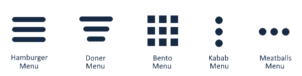
This icon was generally known as the ‘collapsed menu icon’ and pressing it would open the menu out however owing to its look, and since developers are powered by food, it quickly got nicknamed the Hamburger menu.
This simple solution, however, presented a new problem. Due to the limited space within mobile design, the ability to pack additional information away way was desirable, but other such icons didn’t exist, and user already associated the Hamburger with the main menu more icon were needed.
The next icon to appear was 3 dots on top of each other. This was used to denote ‘additional options’, so could contain save as links, sharing options and the like. Unlike the Hamburger menu, which indicated different content, the 3 dots indicated more options about the current content.
This worked and designers / users were happy with it, and they understood it, but it needed a name. Saying 3 dots on top of each other was too long, but what should it be called? Again, geeks being geeks, and with the existing of the term hamburger menu, the kebab menu was born.
And when you have 2 design elements that follow a similar naming convention, that path becomes set. A grid view icon (a 3×3 square of squares) was quickly coined the bento icon, a filtering icon (3 lines of decreasing width) became the Doner Menu; and so it went on.
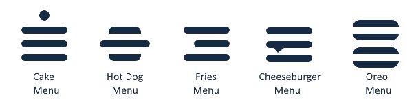
Even fancier icons have entered the field in recent years, like the cake icon, the hotdog icon & the fries icon.
So the next time you see an icon within mobile design, feel confident that it has a name, that it will be food related; and, yes, worry about the types of food designers and developers eat?